Habit Maker + PersonalityFinder
Two live consumer products for the Japanese market, designed and directed end to end.
The brief
A PhD-directed client had validated behavioral science and needed it turned into consumer products for users in Japan.
The honest craft problem: the underlying instrument is a survey. The design work was the engagement layer that makes what is essentially a radio-button form feel worth finishing.
Tighter budget requirements were one of the real design constraints. The engagement layer had to do its job within a lean production envelope, so every element had to earn its place.
Role & scope
The behavioral framework is the client's. Everything else was mine: I designed the products and hired and directed the team that built them, with the technical backend implemented at my direction rather than by me personally.
Two live products, Japanese primary with English versions. PersonalityFinder is a behavioral-economics decision-making diagnostic that runs about three minutes.
Process: the decisions
Gamifying a radio-button form
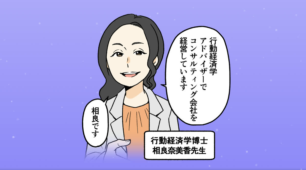
Everything in the design stemmed from one idea: user funnel design. Interesting art and a light story arc, told through 2D illustration, gave people a reason to keep going. The underlying survey questions were gated into manageable chunks instead of one long form. And small midway payoffs, delivered partway through, gave people wins that kept them moving forward.
Designing bilingual, Japan-first
The team leaned heavily on their Japanese counterparts for the calls that mattered most here: attention span, and how much text Japanese users would actually read and engage with. Those decisions shaped how dense each step could be, and where the writing had to give way to illustration.
The report and scoring UX
The reports users get at the end are genuinely impressive, and that content is the client's specialty and IP, not mine. What testing made clear is that users responded strongly to the in-depth, substantive text reports. That depth was the payoff.
So the design choice was restraint. Rather than piling on extra modules or visualizations, the team stayed out of the way of what the client's science already delivered well, keeping the substance front and center instead of diluting it.
Outcome
People finished because the payoff, an in-depth, genuinely useful report, was worth getting to. That's good for the people using it, and it happens to be good for the client's completion numbers too.
The engagement produced follow-on work: one client, two products.
Media